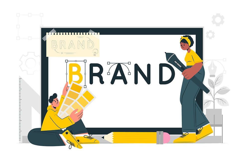
Branding by Design: How Visual Identity Shapes Emotional Connection
- Shash Cates

- Aug 6, 2025
- 2 min read
Updated: Aug 13, 2025
We process visuals thousands of times faster than words. Before customers ever read your headline, they’ve already made a judgment based on your colors, typography, and layout. That’s why your visual identity is more than an aesthetic choice — it’s an emotional shortcut that tells people what to expect and how to feel.
We process visuals thousands of times faster than words. Before customers ever read your headline, they’ve already made a judgment based on your colors, typography, and layout. That’s why your visual identity is more than an aesthetic choice — it’s an emotional shortcut that tells people what to expect and how to feel.
The Psychology of Design
Color: Blue conveys trust (banks, tech). Red triggers urgency (sales, entertainment).
Typography: A modern sans-serif signals innovation. A playful script feels friendly and personal.
Layout & whitespace: Minimal design suggests luxury. Dense visuals can imply value-packed.
Your design is emotional code, helping people quickly “get” your brand without reading a word.
Why Consistency Builds Confidence
When your website, ads, packaging, and emails all look like they belong together, customers subconsciously think:
This brand is professional.
They care about quality.
I can trust them.
But Flexibility Wins in 2025
Coherence matters more than rigid sameness.A playful brand can show up differently on TikTok than in a B2B investor pitch — as long as the underlying DNA is clear.
Closing Thought: A strong visual identity doesn’t just catch the eye — it stirs the heart, inviting people to believe in your brand.
Need a brand design system that sparks connection and scales across channels? Partner with Gilded Tusk Creative to craft visuals that earn trust from the first glance.
Comments